Home Design Update: Living Room + Kitchen Reveal
It took us awhile to get here and we’re still not technically “done” decorating (we want to hang more art, mostly!), but I can finally say that our living room and kitchen are fully set up! I’m no design expert or interior designer, so my design process by no means is technical or professional; I go on my gut, do a lot of research, and today I’m sharing my process to piece together a room without it looking like a bunch of pieces randomly thrown together!
We moved 2.5 months ago after buying this house, but it took a full month for the movers to even arrive with our stuff, we had lots of expenses with more urgent homeowner things (the not-so-cute stuff like electrical work, termites, and killer weeds— IYKYK from IG, so our resources were directed at less fun things than decor), and of course, shipping delays everywhere.
Planning the Decor Process
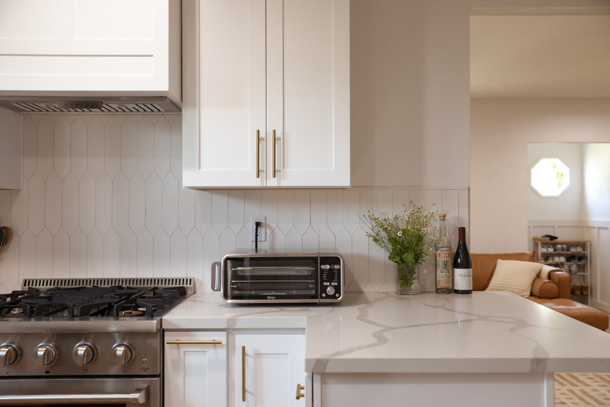
We brought almost all our furniture from our Brooklyn apartment with us, and knew we wanted to incorporate as much of our existing items into our new house’s design for both budget + sustainability purposes. Another important consideration too, was that I decorated the Brooklyn apartment by myself (because I was single + living alone when I furnished the place + designed it), so we wanted to make sure this house really felt like OUR home together with our shared selections. The house also came with a lot of fixtures and features we weren’t planning on changing for budget purposes for now, so we had to take that into account: the brass chandelier, the gold hardware in the kitchen, and the warm light grey color of the board + batten. These existing fixtures combined with the furniture we brought from Brooklyn did pretty much establish the general color range and feel that we’d be working with.
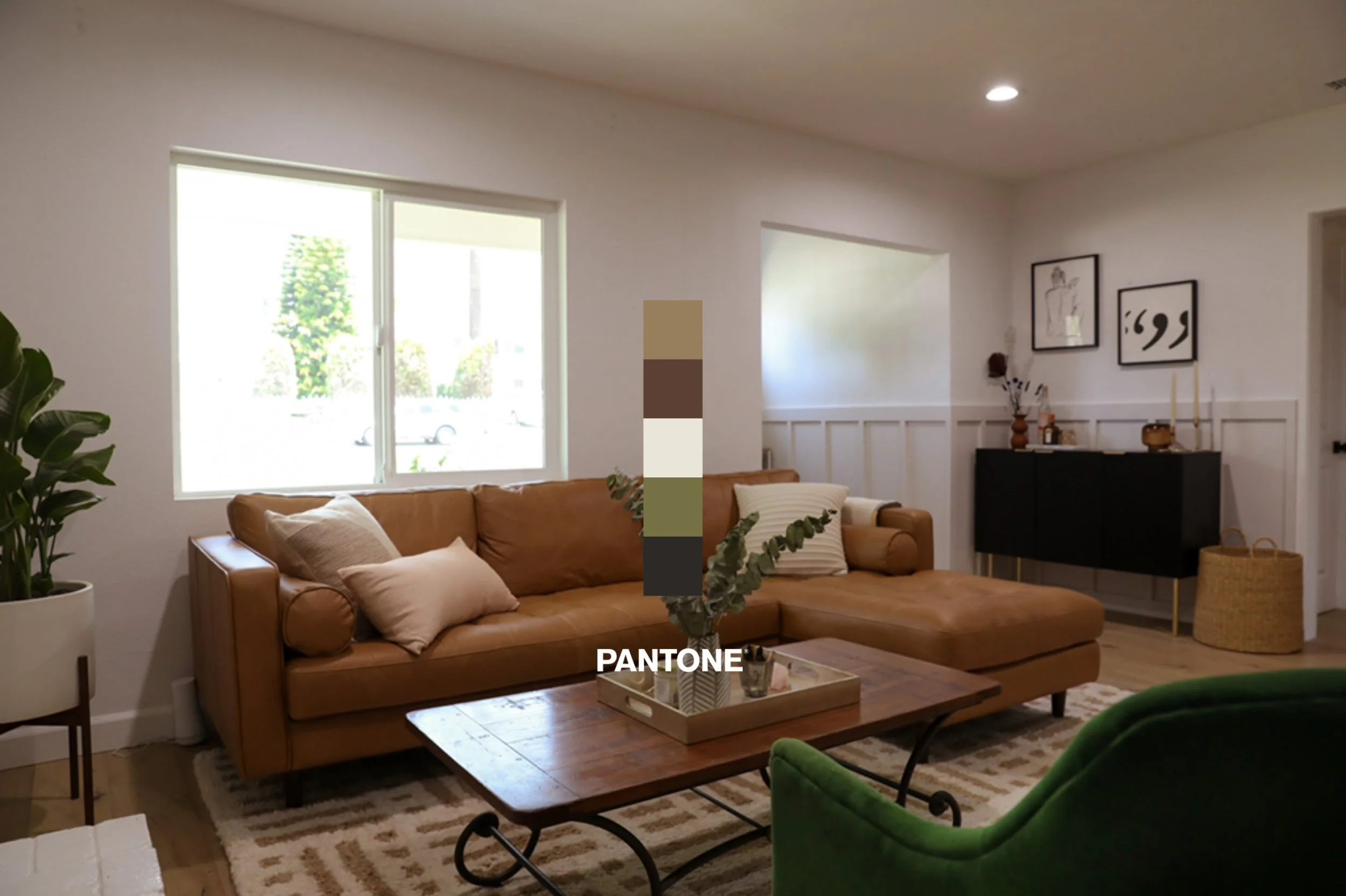
We picked our new benchmark furniture pieces first (keeping our existing furniture in mind), to establish the color palette. More on furniture selections in the next section of this blog post, but we chose a tan leather sofa, a medium brown oak table, and then we had a mixed wood+ metal coffee table— knowing this, and the general color family, we knew we wanted to stick with lots of natural, earthy colors but mix it up with mixed materials (varying between wood, black metal, brass, lighter textural pieces like rugs / seat cushions) so the place didn’t look like one beige and brown room. That is a look and it can look super cute, but for us, we wanted some more variety. So we decided on a color palette first (did a fun Pantone palette below just to show you the color family it ended up being!), which helped narrow down furniture/rug selections, then based on that assortment, we chose the individual pieces based on textile/materials (keeping the whole room in mind).
We also reused a lot of our decor pieces like planters, tabletop accessories, and we also used our artwork from Brooklyn— for the main large photo frame above the fireplace, we reused our frame from a Minted art piece and had one of my old photos of NYC printed, as a little piece of home in our new home.
Our house is just under 1200 sq ft— so it’s not a massive space either that we had to fill with a TON of new furniture. We knew that we wanted a few select new pieces to anchor the rest of the house design around, so that was our starting point with design: a bigger dining table (our old one we sold before moving only really comfortably seated 3 people max), and a sectional sofa (because of this long boi that takes up most of the couch) were the 2 major items on that list.
We did our best to balance everything we were working with, and thankfully, Justin and I had pretty similar intentions for how we wanted our space to look and feel! The goal was to create a relaxed vibe that felt truly functional— there are a lot of beautifully designed houses that our design-oriented eyes both go nuts over, but many of those spaces to us feel like houses where you’re afraid to touch anything and we didn’t want an intimidating space, especially since we both WFH. Inviting, warm, functional, with a bit of personal flair with mixed materials and splashes of contrasting hues to break up the all neutral everything; that was our focus.
My maybe unconventional but biggest tip for designing a whole room? Rather than having every single piece that goes into your room be exactly to your taste, consider the room as a WHOLE. For example, I wouldn’t have chosen this sideboard on its own, but we needed a storage piece (we have no closets in any main area of the house) in a darker color to break up the more neutral living room, and I think it works really well in the space and creates a room that we love, which is more important to me than that one individual piece. As for smaller decor pieces, you all know I love my plants, but I shared some easy affordable tips here!
Left to Right: Chair // Fireplace Screen // Rug // Sofa // Pillows — (old bookcase + vintage coffee table)
Choosing Furniture
As I said earlier, we brought most of our furniture from Brooklyn but were looking for 2 key furniture items: a new dining table (and chairs), and a sectional sofa.
We LOVED our old sofa from Brooklyn (and it’s now in Justin’s office!) and we originally wanted to just use that, but we really needed a sectional for our family to be able to comfortably lay together on the couch. I was SO happy to realize that Article made a sectional version of our Sven Sofa, because it fulfilled all the criteria we were looking for! We knew we wanted a leather material (because it’s easier to clean Benny’s hair off of), and our original Sven sofa’s Italian-tanned leather developed such a beautiful vintage patina over the 5 years we had it, showing us proof of longevity and quality. The cushions for us held up really well and it’s unbelievably comfortable. It was also our first furniture piece in our house (besides our bed) and I was thrilled with how fast the in-stock items shipped— a maaaajor bonus when you’re moving and have nowhere to sit!
Then this rug from The Citizenry is just *chefs kiss* underneath the beautiful tan leather of the sofa. It’s also very soft, and visually breaks up the room a bit with some texture and a pattern that stand out without being too distracting. Our pillows on the sofa are also from there too!
Dining Table // Dining Chairs // Rug
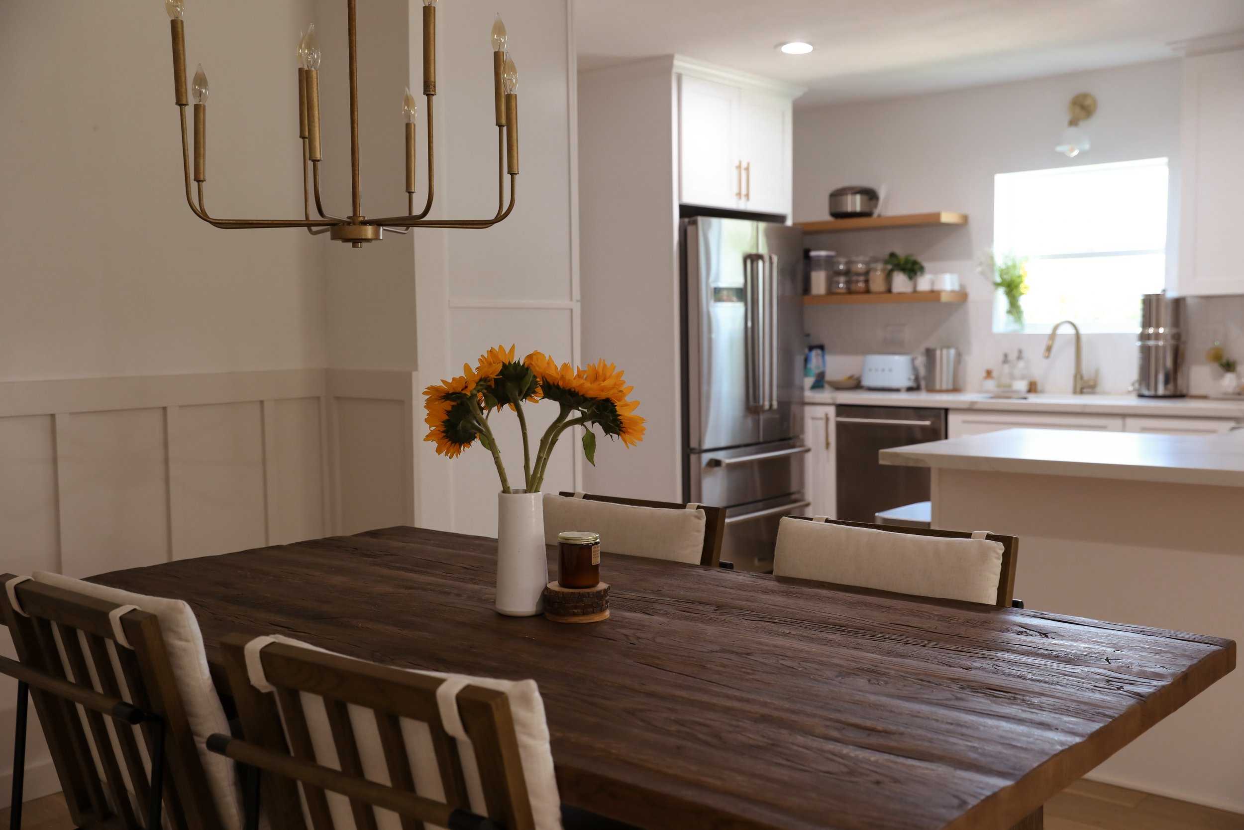
As for our dining table, Justin and I both feel like this table is out of our league 🤣 It’s from a newer-to-me company called Sixpenny that makes some gorgeous, sustainable furniture that is indeed an investment, but the quality lives up to it. The table is made entirely from reclaimed solid oak, and I LOVE that no table is exactly alike because of that. The natural deep grain pattern is stunning and adds so much character to our space— it anchors the entire dining space. I looked through SO MANY chairs to find the right chairs to match this table, and I didn’t originally intend on budgeting this much for chairs but no other chair I looked at felt right for the space and for this table, so we ended up going with these chairs. The mixed metal, oak, and perfect creamy ivory colored cushions balanced out the look exactly how I imagined. Then we decided on this neutral rug with a bit of a pattern, and it was really well-priced for the quality— Benny’s nails have dug it up a bit, but we honestly don’t mind that much.
Sideboard // Alabaster Tray // Hurricane Candle Holder // Brass Taper Candle Holder // Basket // Artwork on left— (vase from local shop)
I actually didn’t really want an other furniture piece crowding up the space, because our living room isn’t massive, but we realized that we don’t have any closets or storage solutions in the living area. We searched high and low for a sideboard that would have ample room for storage, while creating a separate feel for this nook— we found this sideboard that fit our budget, and decorated with some decor items (linked above) that were a little different than the rest of our home, and hung those 2 artwork pieces that we had in our old apartment. I told J this is our little sexy bar cabinet corner 🤣 Issa vibe!
We’re still working on putting together finishing touches for the bedrooms of the house, but that will be coming soon! I love this Reel here, showing the before + after of these rooms though— the empty house when we saw it for the first time, versus now🥰
Special thanks to my partners at Article, SixPenny, and The Citizenry for helping us create such a beautiful space! As always, all opinions and reviews are completely my own.
This blog post contains affiliate links, from which I may make a small commission from purchases made through the link at no cost to you. Appreciate your support in what keeps this blog possible!


